
June 1, 2026
Restaurant Manager Dashboard Metrics That Matter
Learn which restaurant manager dashboard metrics matter most to control labor, sales mix, ticket times, waste, and margin before the shift ends.
A 1-point labor swing on a $2.2M restaurant is $22,000 a year. A 0.5-point food cost miss adds another $11,000. Most managers can influence both during the shift, but only if the dashboard shows signals early enough to change staffing, pacing, and production.
The useful restaurant manager dashboard metrics that matter are the ones tied to a decision in the next hour, the next shift, or the next week. Everything else is reporting.
What makes a restaurant dashboard metric worth tracking
 A useful restaurant metric is timely, controllable, comparable, and tied to a decision.
Most restaurant KPI dashboard setups fail for a simple reason: they collect data that is interesting after the fact. Managers need data that changes behavior before the shift is over.
A useful metric has four properties.
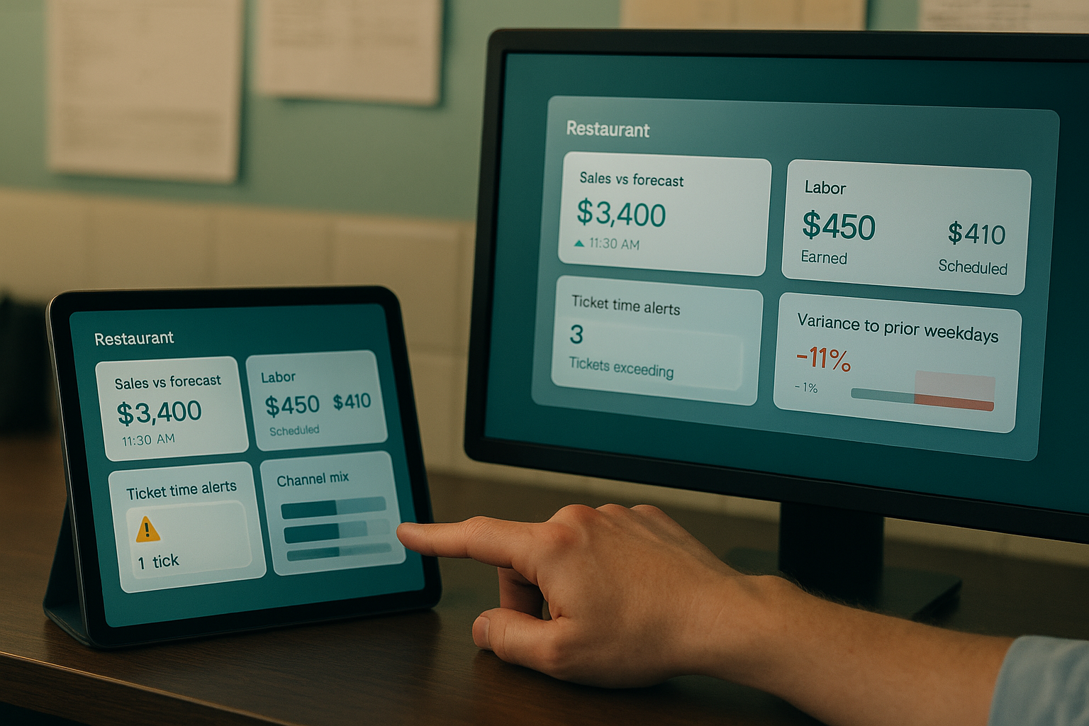
First, it is timely. Net sales at month close has accounting value. Sales vs forecast by 11:30 a.m. has operating value. Labor % after payroll runs is historical. Labor dollars scheduled vs labor dollars earned by current sales is actionable.
Second, it is controllable. A manager can adjust cut times, call in support, 86 a low-stock item, re-sequence prep, or coach modifier entry. They cannot change rent, card fees, or weather. Keep the dashboard centered on outcomes the shift leader can influence directly.
Third, it is comparable. Raw sales alone tells very little. Sales by daypart vs prior four same weekdays, ticket time by channel, PMIX by lunch shift, and void rate by manager-on-duty give a frame for judgment. Good restaurant dashboard metrics show variance to plan, variance to prior period, and variance across stores or shifts using the same definitions.
Fourth, it connects to a decision tree. If labor % rises above target, the next move should be obvious: delay a clock-in, shorten a break overlap, redeploy a cashier to expo, or trim non-peak coverage. If ticket time jumps, the dashboard should also show order channel, station backlog, item mix, and 86 risk so the manager can isolate cause.
This is the difference between a vanity metric and a management metric. One fills a report. The other changes the shift.
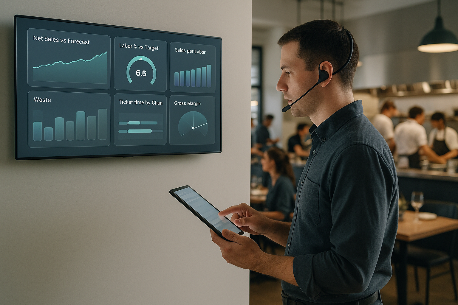
The core metric groups every restaurant manager dashboard should include
 A strong manager dashboard groups metrics around sales, labor, and kitchen throughput.
Operators do not need 40 tiles on the home screen. They need a small set of metric groups that reflect how a restaurant actually runs. Five groups cover most of the daily management job.
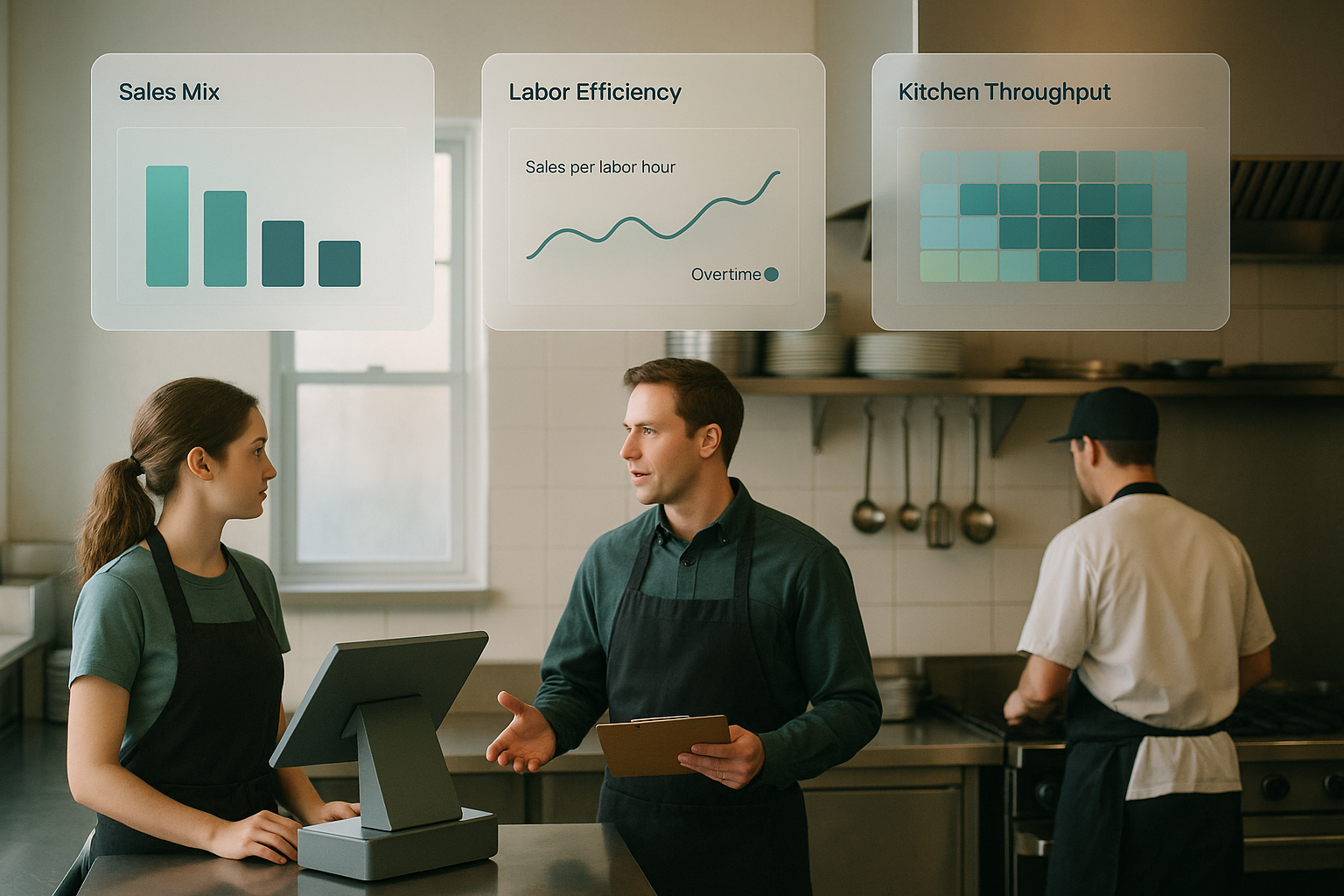
1. Sales and mix
Sales volume matters, but sales quality matters more. A restaurant manager daily dashboard should show:
- Net sales vs forecast
- Transactions or covers
- Average check or average order value
- PMIX for top categories and high-margin items
- Channel mix: dine-in, pickup, delivery, catering
- Modifier attachment rate or combo attach rate where relevant
These metrics explain whether revenue is tracking because traffic is up, pricing is up, check averages are slipping, or low-margin items are carrying the day. A $4,500 lunch can be healthy or weak depending on discount rate, channel mix, and item mix. PMIX is especially important because margin moves with mix before menu price changes catch up.
2. Labor efficiency
Labor is one of the clearest examples of a KPI for restaurant manager teams because it can be adjusted in near real time. Track:
- Labor cost % and labor dollars vs sales
- Scheduled labor vs actual labor
- Sales per labor hour
- Overtime hours
- Clock-in variance and early/late punches
- Manager labor and nonproductive time where applicable
Labor percent in isolation can mislead. Sales per labor hour provides an efficiency view. Scheduled vs actual shows process discipline. Overtime is often a planning failure rather than a volume problem. These restaurant labor and food cost metrics should sit next to sales so a manager sees the ratio in context.
3. Kitchen throughput
Service speed affects guest satisfaction, throughput, refunds, and labor productivity. Core kitchen metrics include:
- Ticket time by channel and daypart
- Make-line or station backlog
- Order promise time adherence for off-premise
- Bump time from KDS
- Item fire-to-complete time for bottleneck categories
- 86 list status and stockout risk
A kitchen metric is valuable when it helps the manager intervene before delays cascade. Ticket time after the rush is a postmortem. Ticket time by 15-minute interval with channel segmentation is an operating tool.
4. Inventory and waste signals
Most managers cannot do full inventory counts during service. They still need early warnings. Watch:
- Theoretical vs actual usage variance
- Waste log dollars
- Prep overproduction
- Low-stock alerts on critical SKUs
- Yield variance on proteins and produce
- Food cost % by category for weekly review
These are not all shift-level metrics. Some work better daily or weekly. The point is to surface loss signals before the period closes. If chicken usage variance spikes on Tuesday, the manager can check portioning, comps, spoilage, or unrecorded transfers by Wednesday.
5. Exceptions and loss indicators
A dashboard should make unusual activity obvious. This group often protects more margin than broad averages.
- Void rate
- Comp checks and comp dollars
- Discount rate by type
- Refunds and remakes
- Cash over/short
- Open checks aging
- Deleted items, no-sales, and manager overrides
Exception indicators work because they highlight behavior that deserves review. A void rate of 3.8% means very different things if one cashier accounts for half of it. Grouping exceptions in one place prevents them from getting buried under sales totals.
Which metrics matter most by management objective
The right restaurant operations metrics depend on the job the manager is trying to do. Shift control, weekly review, and multi-unit oversight require different views.
Protecting margin
Margin protection starts with three clusters: PMIX, labor efficiency, and waste signals. For daily control, look at sales mix, discount rate, labor % vs forecast, and high-variance ingredients. For weekly review, add theoretical vs actual usage, category food cost, overtime, and promo performance.
A manager protecting margin does not need every top-line number. They need to know whether a sales gain came from profitable items, whether labor scaled appropriately, and whether usage tracked what was sold.
Staffing correctly
Staffing decisions require a narrower set: forecast vs actual sales, transactions by 15 or 30 minutes, sales per labor hour, clock-in variance, and overtime risk. Add channel mix if off-premise demand changes staffing needs.
This is where many restaurant KPI dashboard designs fail. They show total labor hours after the shift instead of earned labor against live demand. Managers end up either holding excess labor too long or cutting too aggressively and hurting service.
Improving service speed
For speed of service, prioritize ticket time by channel, order queue depth, KDS bump times, remakes, and promise-time adherence. Average check and labor % still matter, but they are supporting context, not primary controls.
A 2-minute increase in average ticket time during lunch can reduce throughput enough to offset a good check average. Service metrics need to sit close to order volume and channel mix so the manager can see whether the issue is capacity, routing, item complexity, or staffing.
Reducing loss
Loss prevention is usually hidden in small percentages. Void rate, comp checks, refund rate, deleted items, no-sales, and cash variance deserve a dedicated panel. Compare by employee, manager-on-duty, and shift. Review spikes daily, not monthly.
Exception metrics become even more useful when paired with context. A higher comp rate during a kitchen outage has a different meaning than the same rate during a normal Friday dinner.
Managing consistency across locations
Multi-unit operators need fewer metrics, standardized tightly. Net sales vs plan, labor %, sales per labor hour, ticket time, PMIX, void rate, and food variance can cover most oversight. Definitions must stay identical across every store.
Cross-store dashboards break when one location records comps differently, another batches discounts into a misc bucket, and a third closes checks on a different timing rule. Consistency in definitions matters as much as the numbers themselves.
Why context matters more than benchmarks alone
Benchmarks are useful. Context is where decisions come from.
A labor cost of 29% may be high for one concept and normal for another. A 7-minute ticket time may be acceptable at dinner and unacceptable for a weekday lunch-heavy fast-casual unit. Raw numbers without operating context cause managers to chase the wrong problem.
Five context layers matter most.
Daypart. Breakfast, lunch, afternoon, and dinner have different demand curves, staffing models, and check averages. Compare lunch to lunch, not to the daily blended average.
Channel. Dine-in, pickup, delivery, and catering produce different ticket times, margin structures, and labor requirements. Off-premise growth can raise sales while pressuring expo and packaging labor.
Menu mix. A shift heavy on fried items, modifiers, or premium proteins will affect throughput and cost differently from a beverage-led or combo-led shift. PMIX should sit near ticket time and food variance for this reason.
Seasonality and promotions. Limited-time offers, holidays, weather, school calendars, and local events distort simple period-over-period comparisons. Variance to forecast is often more informative than variance to last week.
Staffing context. A shift staffed with trainees should not be read the same way as one staffed with veteran closers. Labor hours may be on plan while productivity drops because the mix of labor changed.
This is why trend lines and variance views outperform static targets. A restaurant manager daily dashboard should answer three questions quickly: Are we off plan, where did the variance start, and what can be changed now?
The dashboard mistakes that create noise instead of action
The common dashboard problems are structural, not analytical.
Too many metrics is the first one. A manager working lunch needs eight to twelve numbers, not thirty. Every extra tile competes for attention during the period where decisions are time-sensitive.
Lagging views are the second. Monthly P&L data is necessary. It is not a management dashboard. Daily and intraday signals matter more for labor, speed, stockouts, and exceptions.
Inconsistent definitions create the third problem. If one store calculates labor % with salaried managers included and another excludes them, comparisons are useless. If voids and comps are not categorized the same way, exception analysis breaks.
Disconnected systems create the fourth. Sales in one system, schedules in another, KDS data in another, and inventory somewhere else produce fragmented metrics. Managers see symptoms without causes. Ticket time goes up, but they cannot tie it to item mix, staffing, or stockouts in one view.
Single-metric optimization is the fifth. Cutting labor to hit a target can worsen ticket time, remake rate, and guest recovery costs. Driving average check through discounts can hurt margin quality. Good dashboards make tradeoffs visible.
A practical restaurant KPI dashboard is narrow, timely, and integrated. The goal is operational control, not metric volume.
How Bagel helps managers turn metrics into operational control
Bagel brings POS, KDS, inventory, scheduling, analytics, and multi-location reporting into one operating system. That changes the quality of the dashboard because the metrics share the same underlying definitions and update in the same context.
Managers can see sales vs forecast next to labor, ticket times next to order channel, and food variance next to PMIX and stockout risk. Multi-unit leaders can compare stores on the same metric logic instead of reconciling separate reports. Shift leaders get a smaller set of signals tied to decisions they can make immediately.
That is the difference between a dashboard that explains last week and one that helps run today. If you are reworking your restaurant manager daily dashboard, Bagel is opening early access for operators who want a tighter view of the metrics that actually move margin, speed, and consistency.
Run your restaurant on Bagel
Join the early access program and shape the operating system built for modern hospitality.
Get early access →